
THE TECHNICAL SIDE: VAIR*
 Baz Manning, FHS, FSHA
The Heraldic Craftsman No. 15, Winter 1993
In a departure from our in-depth series of specific aspects of the craftsman’s art (several more of which would be ready for publication but for pressure of work), we are looking in this issue at the particular problems an artist has when depicting vair.
As always in these technical articles, it is written primarily for those with little or no knowledge of the subject, but still has enough information in it to be of interest to all. This is to reflect the varied experience of our readership.
Vair was originally a widely used fur in the lining of cloaks: Geoffrey Plantaqenet (knighted in 1127), whose well known tomb effigy clearly shows this. The fur was that of the ver or vair, (from the Latin van’s) a kind of squirrel, The belly fur was white while the beck was blue-grey, hence the normal tinctures of argent and azure.
If this fur is to appear balanced and professionally produced, it has to be first drawn geometrically. We have all seen pleasing paintings which have been spoiled by the vair being clumsily portrayed. This seems to be due to the artist being inexperienced in technical drawing, or being under such pressure commercially that he cannot afford the time to accurately portray it, There is no escaping the fact that it is a time-consuming process and requires great discipline of line, in contrast to the freedom of much of an heraldic design, No matter how experienced we become at judging the proportions of charges in relation to the shield, vair slows us down.
A successful design must look balanced. It should begin and end halfway through a ‘bell’ and all bells should be identical, To begin with, a grid has to be drawn to cover the area accurately. The grid corresponds to each change of angle in the bells and must start and finish at the extreme edges of the shield, or ordinary. Decide now whether the first and last bells will be upright or inverted, and how many are to appear. A quick sketch can fix this in your mind.
Measure the width of the shield. If fig.1 is your choice divide this measurement by any multiple of 3; If fig. 2, any multiple of 4. For example, one whole bell and two halves, such as may appear on a bend or cross, (figs. 2 & 3) divide the width by 4, for three upriqht and two and two half inverted bells, as may appear on a chief, divide by 12 (fig.1), It is conventional to depict the same half bell at either end, but artistic reasons may dictate otherwise at times, You now have the vertical lines of the grid.
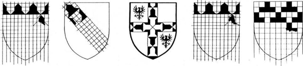
The horizontal grid lines are usually a multiple of 3 for each row. This will give a bell of equal size (fig,1). The current British fashion is to depict five rows on a field.
For this, measure the total height of the shield and divide by 15. If longer bells are required, such as figs. 3 & 4, change the sizes of the lines accordingly. With the grid complete, draw in the diagonal lines of the apex and base of each bell as accurately as possible. Your design is now ready for painting.
This method is applicable to all forms of vair, as it can, with little thought, be adapted for counter-vair, vair in pale and vair en point, It is also not as complicated as it sounds.
For potent and all its variations, construct the grid on a multiple of 2 (fig, S), It is important to construct the grid in squares to achieve a symmetrical and balanced design, whereas with vair the height and width of the bells can vary according to the needs of the design.
If the early forms of vair are required, such as the ancient wavy forms, or intermediate shapes more reminiscent of a real bell, the grid can still be useful for ensuring accuracy before freehand drawing takes over.
This now brings us to the question of tinctures, It is normal to depict all argent furs as white, rather than silver, for the simple reason that they are furs, not metals. But the ubiquitous Fox-Davies states that there are accepted precedents of silver for vair, so it must be at the discretion of the artist and client. So too, the order in which they come; when the blazon of vair includes the tinctures, which obviously it need not, it usually commences with the metal. In British heraldry the blue bells are usually in the upper line, i.e. inverted, but there is no reason why this should be so, beyond fashion. Having pored through a number of heraldic works I can find many examples where the white bells are inverted, the earliest example being Geoffrey Plantagenet’s tomb effigy, again, It takes a brave artist to depart from the conventions of generations that a client may expect, but strictly speaking, if the blazon is vair Argent and Azure, or vair Or and Gules, the metal should be on the inverted bells. I have spent hours discussing this point with one client, to no avail, so your thoughts on this matter would be appreciated.
The rationale behind my argument is that if top takes precedence over bottom in blazon, and dexter takes precedence over sinister, the inverted bell will always be the first to appear when depicted horizontally. No matter where the vertical boundary is drawn, a portion of the inverted bell will appear first. As the verbal blazon of vair, when the tinctures are mentioned at all, nearly always commences with the metal, it seems incongruous that the English fur is painted with the colour first. Even Fox-Davies mentions this, calling the first line the upper (inverted) one. He states that the French depiction is metal first, and in his opinion, more correct. As usual, your most heated comments are enthusiastically awaited at the editorial office!